
Make the Dashboard Yours
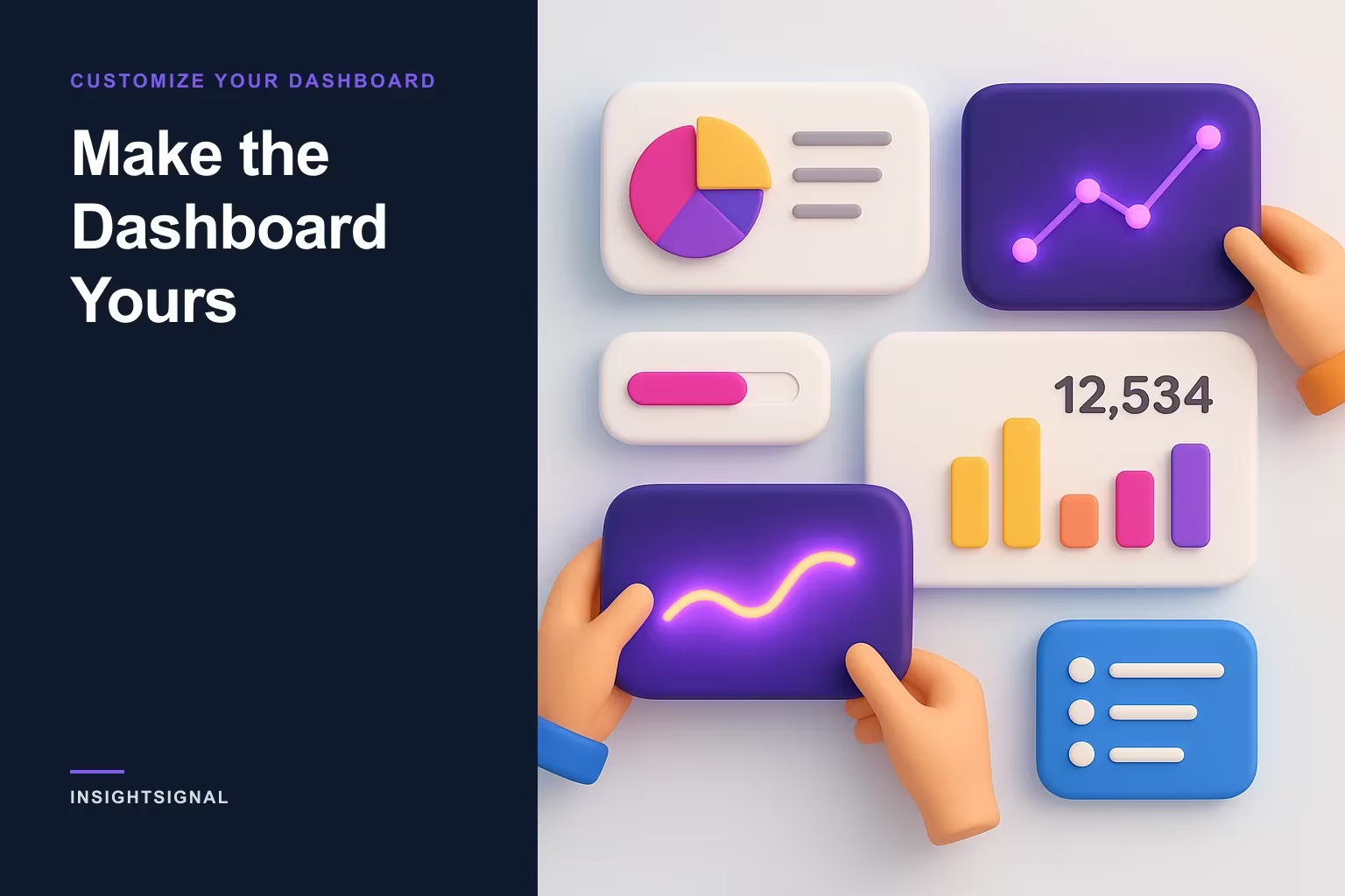
The InsightSignal dashboard is built from draggable, resizable widgets — here's how to shape it around what you actually watch, plus a few small features regulars lean on.
A default dashboard is someone else's priorities
Every analytics screen ships with a guess about what you care about. A BDR watching credit burn, a RevOps lead watching quality trends, and a founder watching totals are all handed the same layout — which means it's slightly wrong for everyone. The InsightSignal dashboard's answer is to be widgets all the way down: everything on it can be moved, resized, added, or removed, and the layout you end with is saved to your account.
Five minutes of rearranging turns it from a report you glance at into a cockpit you actually fly.
The mechanics, in one paragraph
Click and hold any widget's header to drag it — the others rearrange to make room. Grab the bottom-right corner to resize. Click Add Widget in the toolbar to open the widget catalog and browse what's available by category. The X in a widget's top-right corner removes it, and the reset icon in the toolbar restores the default layout if an experiment goes sideways.
Widgets refresh automatically when new data arrives — completed runs, credit updates — and a dropdown adds a manual refresh interval (15s to 5m) if you want a wall-screen cadence. On mobile everything stacks in one column with drag and resize disabled, so a stray thumb can't wreck the layout you built at your desk.
What's in the box
The default set covers the widgets most people keep:
| Widget | What it shows |
|---|---|
| Total Runs | Verification runs completed |
| Companies Verified | Total companies in your database |
| Credit Balance | Available credits right now |
| Avg Quality | Average quality score across companies |
| Quality Trend | Quality scores over time, as a line |
| Grade Distribution | Your A–F breakdown, as a pie |
| Credits by Category | Where credits actually go, by action type |
| Recent Runs | Latest runs with live status |
The tuning is personal. Watching spend? Put Credit Balance and Credits by Category on top, oversized. Selling data quality internally? Lead with Grade Distribution and Quality Trend.
Two habits regulars pair with it
The dashboard tells you what's happening in aggregate; two adjacent features close the loop on individual records:
- Watch the freshness badges. Every company and person carries a badge that ages with the data — "Verified today" → "Verified 3w ago" → "Stale — verified 3mo ago." It's the built-in cue for when to hit Re-verify on a company or Sync on a person. (For a full cadence system, see how often should you re-verify?)
- Customize your table columns. On the Companies and People pages, the column picker in the toolbar toggles columns by category — company info, scores, intent, classification, contact fields — and your choices are saved to your account, along with your preferred rows-per-page. The grid ends up showing the fields you actually work, not all fifteen.
Make the tool fit the job
None of this is glamorous, and that's the point — the difference between a tool you tolerate and one that fits is usually a handful of small adjustments nobody told you about. Rearrange the widgets, promote the numbers you check every morning, trim the table to your working columns, and let the freshness badges nag you so nothing else has to.
New here? Do this right after your first 30 minutes. Then log in at signal.insightopus.com and drag something.
Copyright © 2024–2026 InsightOpus Inc.